Exploring the Possibilities of Embedding Heterogeneous Data Attributes in Familiar Visualizations
Heterogeneous multi-dimensional data are now sufficiently common that they can be referred to as ubiquitous. The most frequent approach to visualizing these data has been to propose different solutions for representing these data. These new solutions are often inventive but tend to be unfamiliar. We take a different approach. We explore the possibility of extending well-known and familiar visualizations through including Heterogeneous Embedded Data Attributes (HEDA) in order to make familiar visualizations more powerful. We demonstrate how HEDA is a generic, interactive visualization component that can extend common visualization techniques while respecting the structure of the familiar layout. HEDA is a tabular visualization building block that enables individuals to visually observe, explore, and query their familiar visualizations through manipulation of embedded multivariate data. We describe the design space of HEDA by exploring its application to familiar visualizations in the D3 gallery. We characterize these familiar visualizations by the extent to which HEDA can facilitate data queries based on attribute reordering.
Extended Materials ·
PDF of the paper ·
Bibtex ·
Slides ·
Authors and Contact
Bibtex
@Article{loorak2017,
Author = { Mona Hosseinkhani Loorak and Charles Perin and Christopher Collins and Sheelagh Carpendale },
Journal= {IEEE Transactions on Visualization and Computer Graphics },
Title= { Exploring the Possibilities of Embedding Heterogeneous Data Attributes in Familiar Visualizations },
Year= {2017},
Volume = { 23 },
Number = { 1 },
Pages= { 581--590},
Keywords = { Context;Data visualization;Encoding;Joining processes;Layout;Space exploration;Visualization;Hybrid visualization;Multi-dimensional data },
DOI = { 10.1109/TVCG.2016.2598586 },
ISSN = { 1077-2626 },
Month = jan
}
Slides
Extended Materials
In the following, we first present how our explored design space of applying HEDA can be thought of as either a hierarchy or a 2D space. The presented tables could motivate further exploration of extending other new visualizations with HEDA and the tables could be extended as needed. We then briefly describe our implemented prototypes of ArcDiagram-HEDA, and Scatterplot-HEDA and provide a link to our implemented prototypes. Both are web-based prototypes implemented in D3.
Design Space of HEDA
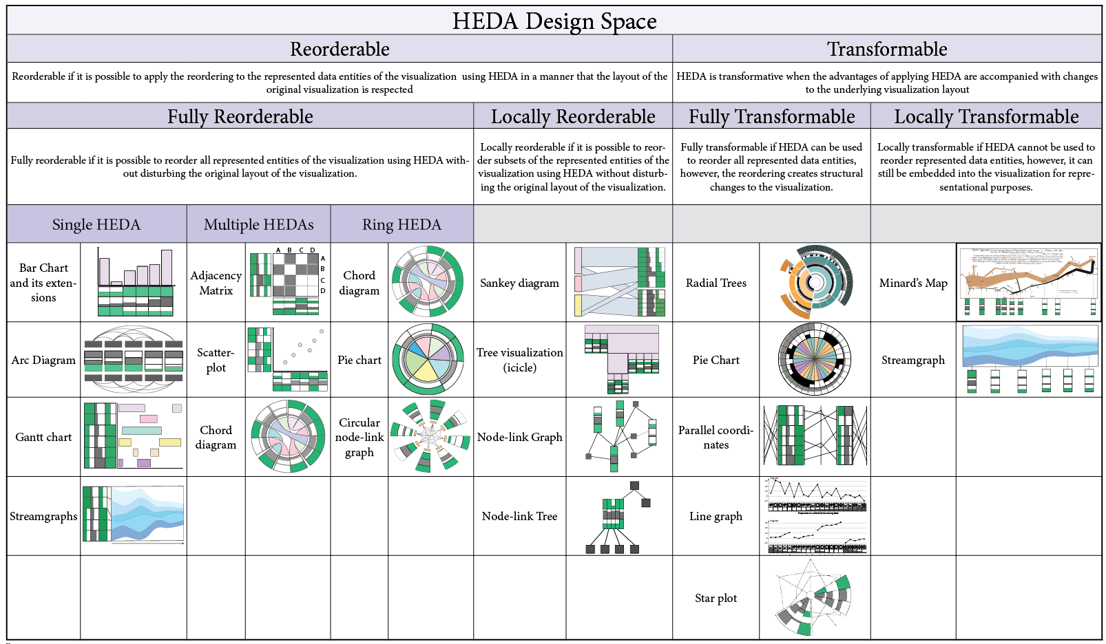
The following table shows our explored design space of applying HEDA to familiar visualizations in the form of a hierarchy.
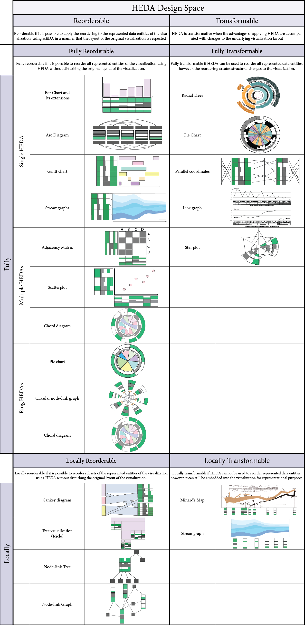
The following table shows our explored design space of applying HEDA to familiar visualizations in the form of a 2D space table.
ArcDiagram-HEDA
In the following, we provide a brief description of our implemented prototype for extending dual arc diagrams with HEDA.
|
Some brief descriptions of how the ArcDigram-HEDA prototype works
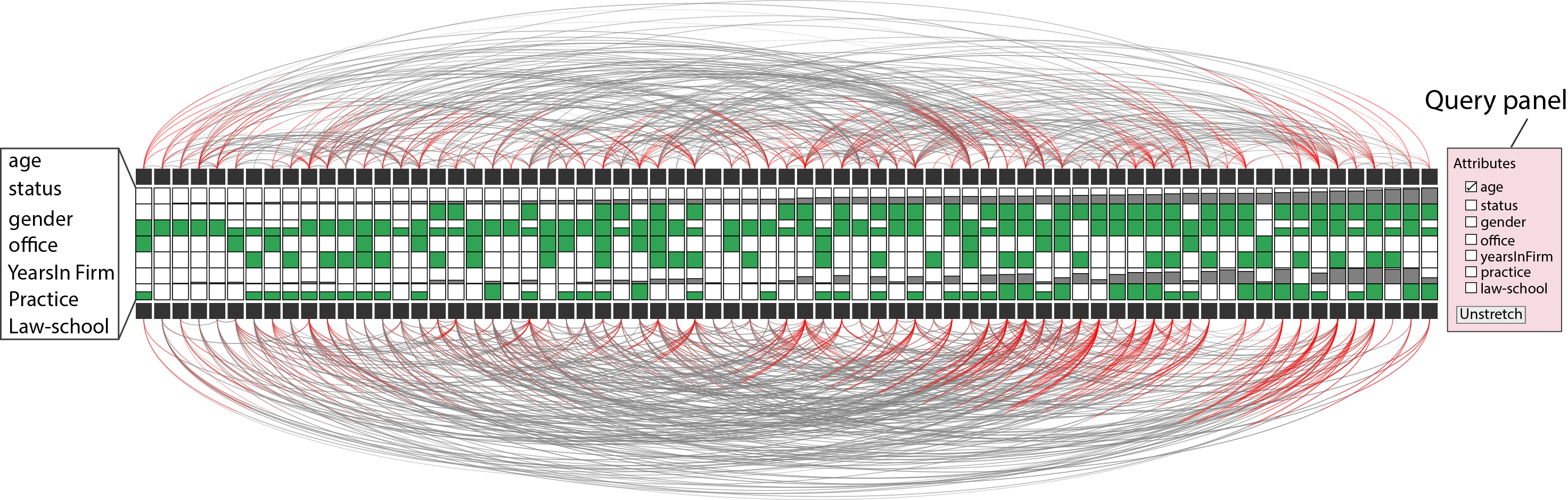
Figure 1 shows the ArcDiagram-HEDA in the stretched mode. Pressing the stretch/Unstretch button in the control panel results in revealing/hiding HEDA, respectively. By selecting attributes in the control panel, then dragging and dropping the selected attribute labels, the reordering priority of entities alters. As a result, we can see the black rectangles (showing entities), their corresponding arcs, and the corresponding vertical HEDS smoothly animated and reordered according to the location of selected attributes in the control panel in relation to each other. For example, if "status", and "age" have been selected in order, then, the entities, their arcs, and their HEDA will be reordered first based on "status" attribute and then based on "age".
Hovering over each black rectangle highlights the outgoing arcs from the hovered node in blue color. Also, hovering shows the detail data of lawyers in a detail view below the query panel.
The location of the attribute rows in HEDA can be changed by dragging and dropping the label of the attributes shown on the left hand side of HEDA.
Categorical Data Encodings: Here are the categorical encodings we used in ArcDiagram-HEDA prototype.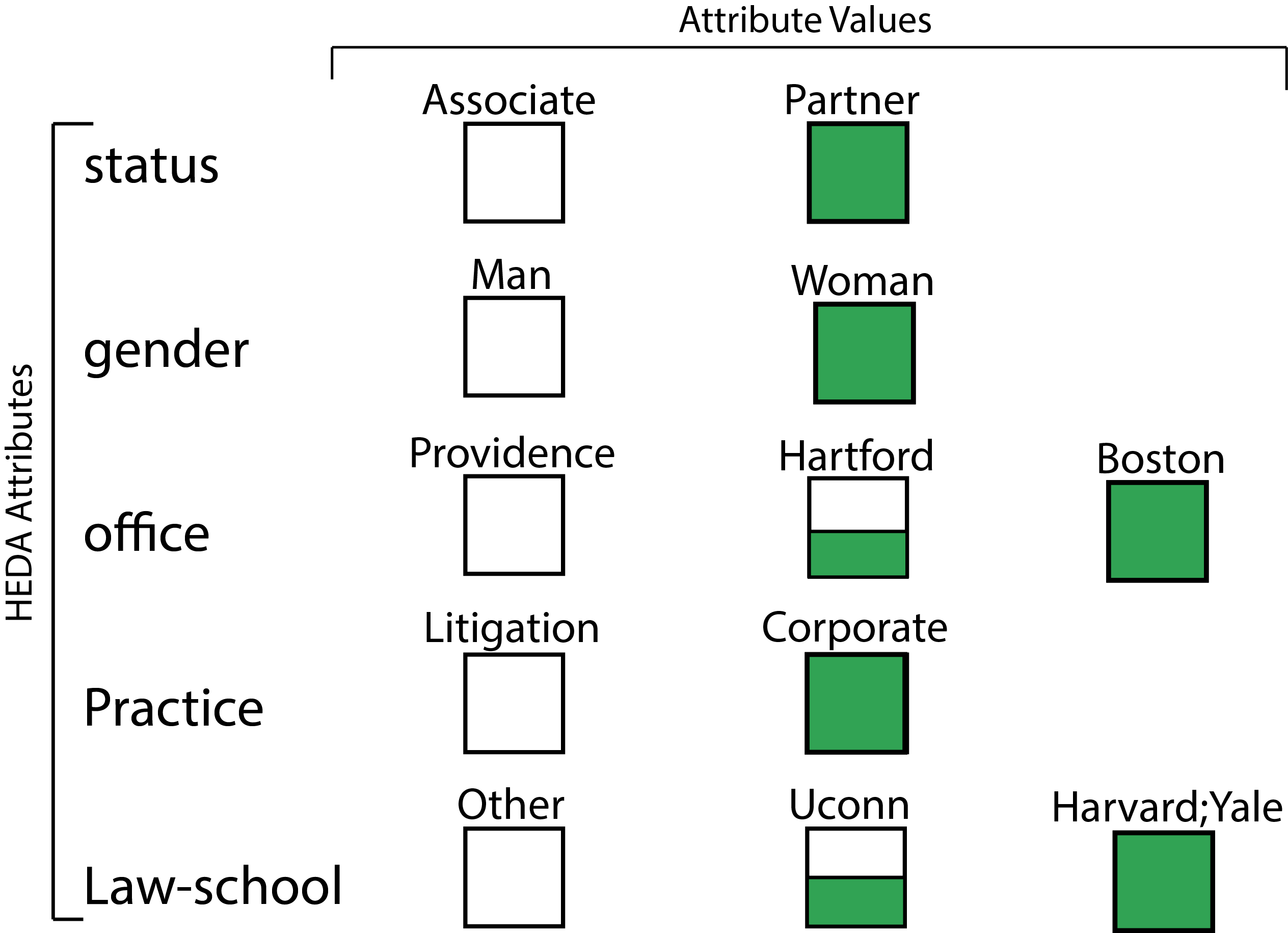
*
The prototype may have some bugs as it is still under development to fix some small issues. However, it is well-capable of showing how HEDA could be embedded into arc diagrams. While interacting with the prototype, please wait for each animation to be completed before triggering another one.
Scatterplot-HEDA
In the following, we provide a brief description of our implemented prototype for extending dual arc diagrams with HEDA.
|
Some brief descriptions of how the Scatterplot-HEDA prototype works
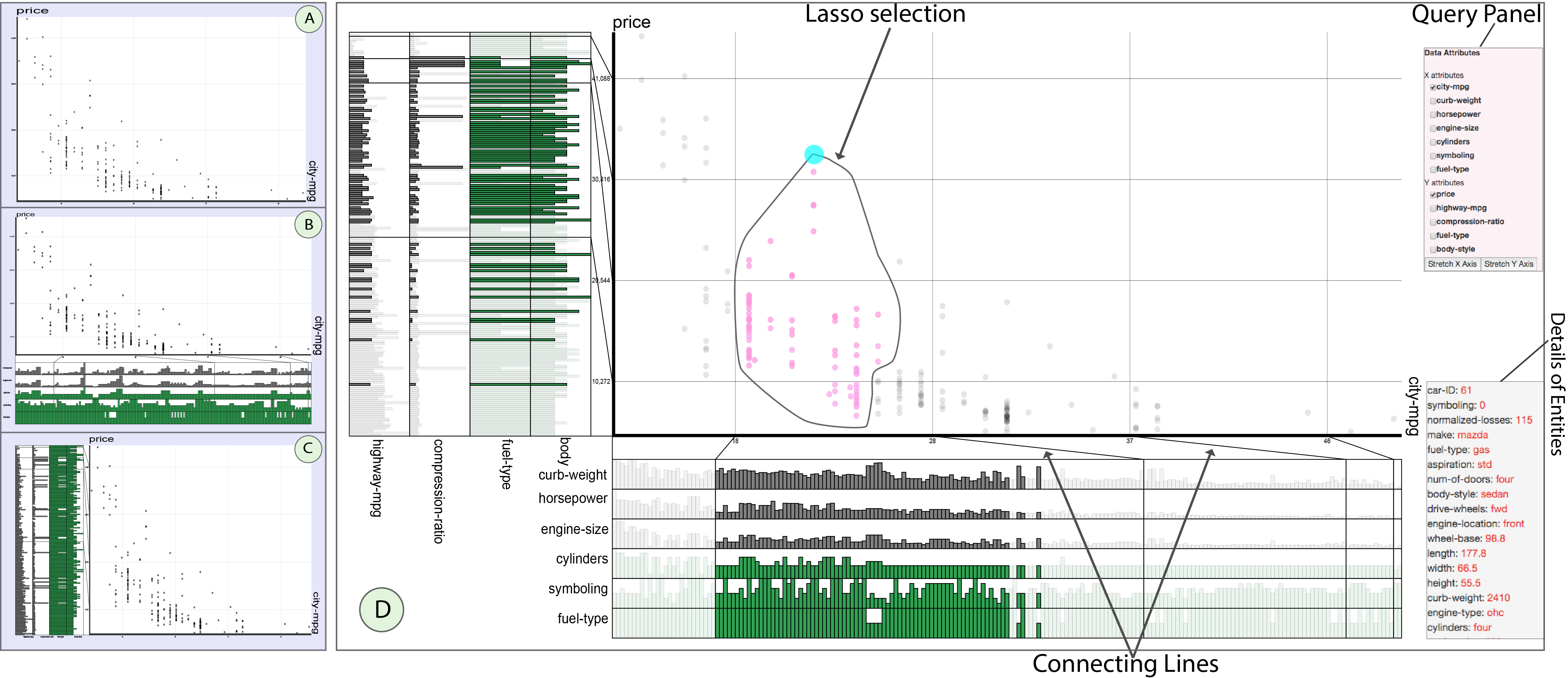
In Scatterplot-HEDA, we provide the possiblity of extending X, Y, or both axes for exploring the data. Before loading Scatterplot-HEDA visualization, a page appears asking you to select a dataset for the visualizastion. We provided the ability to work with two datasets: country ranking dataset, and automobile dataset. Automobile dataset: If the automobile dataset is chosen, then, by default, the X axis shows "city-mpg" which stands for "city mileage per gallon". Y axis shows the price of the car. Pressing "Stretch X" shows HEDA on X axis with the attributes including "horsepower", "engine-size", "symboling" (showing the level of car safety which could be a value between 0-6. Cars with symboling value of "0" are the least safe cars, and those with value "6" are the most safe ones), and "fuel-type" (either gas or diesel). Pressing "Stretch Y" extends the Y axis and shows the attributes including "body-style", "fuel-type", "compression ratio", and "curb-weight". "fuel-type" is repeated on both axes to show the possibility of visualizing one attribute in relation to both X and Y axes. The visualized categorical attributes are "symboling", "fuel-type", and "body-style". The encoding of these attributes are shown in the follwoing: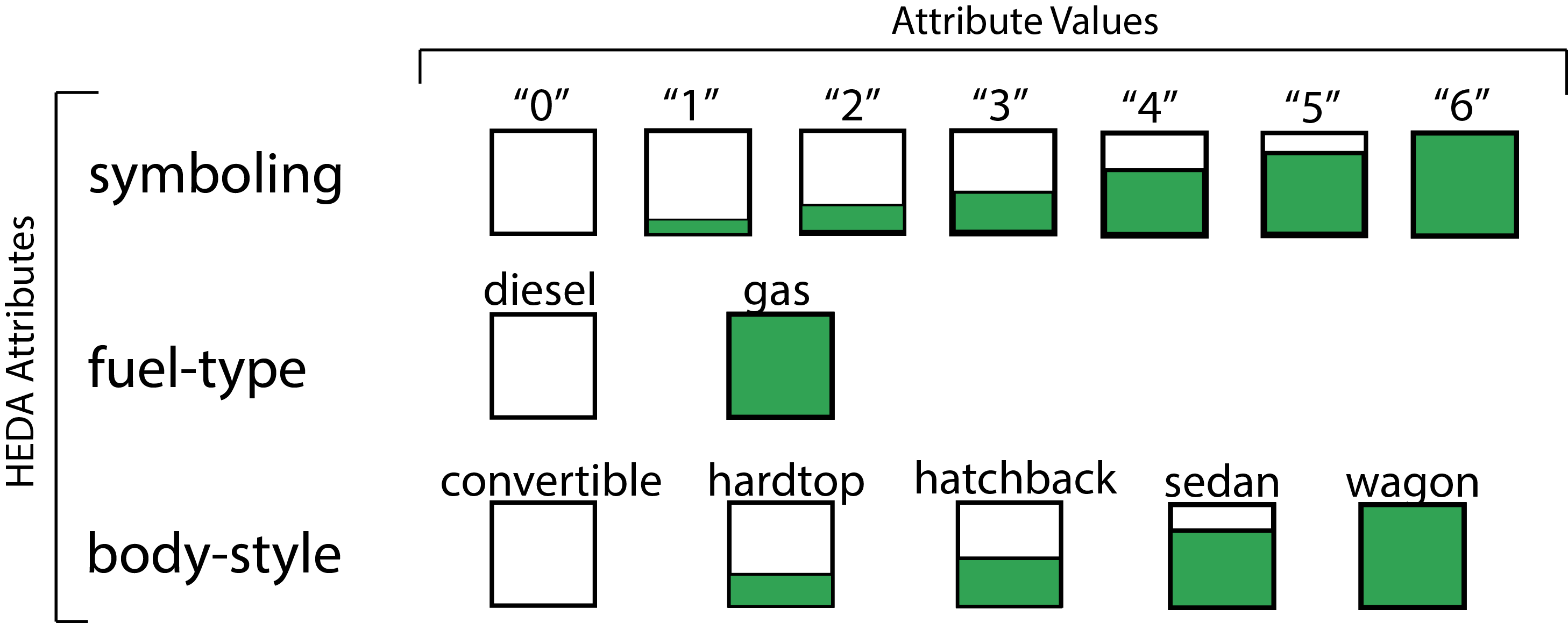
Scatterplot-HEDA Prototype (please open in Chrome)*
In Scatterplot-HEDA, we provide the possiblity of extending X, Y, or both axes for exploring the data. Before loading Scatterplot-HEDA visualization, a page appears asking you to select a dataset for the visualizastion. We provided the ability to work with two datasets: country ranking dataset, and automobile dataset. Automobile dataset: If the automobile dataset is chosen, then, by default, the X axis shows "city-mpg" which stands for "city mileage per gallon". Y axis shows the price of the car. Pressing "Stretch X" shows HEDA on X axis with the attributes including "horsepower", "engine-size", "symboling" (showing the level of car safety which could be a value between 0-6. Cars with symboling value of "0" are the least safe cars, and those with value "6" are the most safe ones), and "fuel-type" (either gas or diesel). Pressing "Stretch Y" extends the Y axis and shows the attributes including "body-style", "fuel-type", "compression ratio", and "curb-weight". "fuel-type" is repeated on both axes to show the possibility of visualizing one attribute in relation to both X and Y axes. The visualized categorical attributes are "symboling", "fuel-type", and "body-style". The encoding of these attributes are shown in the follwoing:
*
The prototype may have some bugs as it is still under development to fix some small issues. However, it is well-capable of showing how HEDA could be embedded into scatterplots. While interacting with the prototype, please wait for each animation to be completed before triggering another one.
Authors

Mona Hosseinkhani Loorak
Mona is a PhD candidate working with Dr. Sheelagh Carpendale in the Innovis Group (Interactions Lab, Department of Computer Science) at the University of Calgary. She is interested in visualizing complex data in novel ways to make the data more accessible to the viewer.

Charles Perin
Charles is a post doctorate researcher in the Innovis Group (Interactions Lab, Department of Computer Science) at the University of Calgary. He graduated in PhD in 2014 from the university of Paris Sud-XI in collaboration with INRIA.

Christopher Collins
Chris is an Associate Professor at University of Ontario Instituite of Technology (UOIT) where he holds a Canada Research Chair in Linguistic Information Visualization. He directs Visualization for Information Analysis lab (vialab) research group and his research focus is interdisciplinary, combining information visualization and HCI with natural language processing.

Sheelagh Carpendale
Sheelagh is a Professor at the University of Calgary where she holds a Canada Research Chair: Information Visualization and an NSERC/iCORE/SMART Industrial Research Chair: Interactive Technologies. She directs the Innovations in Visualization (InnoVis) research group and her research focuses on information visualization, collaborative visualization, and large interactive displays.