Week 11 (Dec 16): Application
Artifacts of the Presence Era: Using Information Visualization to Create an Evocative Souvenir. Fernanda Viegas, Ethan Perry, Ethan Howe, Judith Donath. In the proceedings of the IEEE symposium of Information Visualization, InfoVis’04. InfoVis 2004, in Austin, TX.
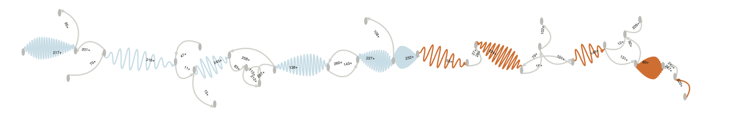
Artifacts of the Presence Era: a digital installation that uses a geological metaphor to visualize the events in a physical space over time.
The piece captures video and audio from a museum and constructs an impressionistic visualization of the evolving history in the space.
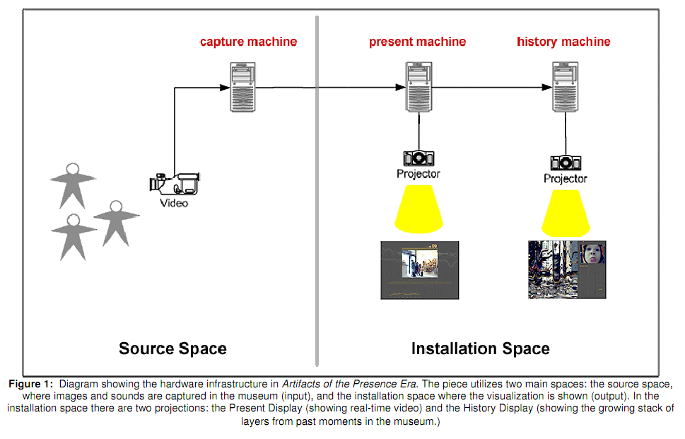
The above diagram shows how the system works, one video capture device at the front of the museum which connects to two machines: one to display the visualization and one to record and display the history vis
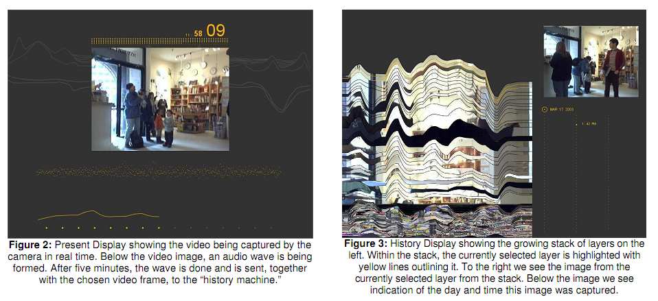
Present display versus history display.
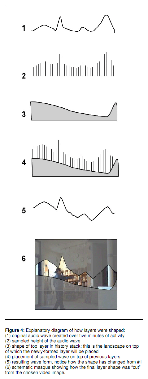
To make the curved shape the audio wave is sampled over five minutes. This is then over-layered on to the existing shape below it. This shape below acts as a unequal platform for the wave histogram which alters its shape. Then a shape is cut from video the shape of the newly produced line.
Black periods/areas indicate night.
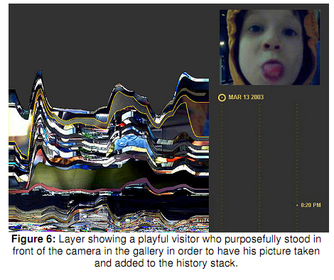
What is interesting is that these shapes also compress to simulate layers of earth that would also compress over time based on the content above them. This is a pretty interesting idea.
-jonathan
ABySS-Explorer: Visualizing Genome Sequence Assemblies.
(2009) Cydney B. Nielsen, Shaun D. Jackman, Inanç Birol, Steven J.M. Jones
Concept and Domain: ABySS Explorer is an interactive graph/visual encoding that captures a lot of detail about genome sequence assemblies (overlap, length, coverage, distance, and meta-data) into a global overview, while "eliminating the need for laborious cross-referencing between data sources".
Data: Genomes consists of one or more chromosomes, which are composed of DNA (or RNA, in the case of viruses) molecules. DNA molecules are composed of sequences of nucleotides, coded by the letters A, C, G, and T. DNA sequences have an inherent directionality. They are made up of two complementary strands (A in one corresponds to T in the other, C corresponds to G, and vice versa).
The data for this visualization comes from the output of the ABySS algorithm. It comes as a set of sequences arranged in a de Bruijn graph; each sequence's start is denoted by 5' and end denoted by 3'. The sequences are ambiguous and overlapping; the task of the genome scientists is (as far as I understand it) to figure out which sequences are the correct ones. This generally involves manually inspecting the sequences and cross-checking with a lot of metadata from other sources.
Related Work: Other genome visualization tools support manual inspection of sequence details, but lack a global overview function, which the genome scientists requested. In addition, metadata about the sequences is often spread over several systems.
Supported tasks: (1) Judge assembly errors one at a time using local information. (2) Use a global overview to find problematic regions. (3) Examine interconnections between contigs using meta-data.
Implementation: Conceptually, the authors take the de Bruijn representation of contiguous sequences ("contigs") - which represents contigs as vertices and overlaps between contigs as edges - and invert it so that contigs are edges and overlaps are vertices. They then use a unique visual encoding for the edges (contigs): they are represented as waves shaped like leaves. Information is encoded as follows:
(1) Vertices show which contigs are overlapping.
(2) The amplitude of the waves is manipulated so that they end up in a leaf shape, denoting contig orientation
(3) Wavelength/total edge length indicates contig length. Longer contigs have shorter wavelengths.
(4) Edge thickness denotes contig sequence coverage.
(5) Read positions are paired with distance estimates.
(6) A colour scheme is used to denote nominal metadata such as gene annotations.
They then visually encode contigs as waves in a leaf shape - longer contigs have a shorter wavelength; the leaf shape indicates directionality; coverage is represented by line thickness; and colour is used to represent metadata (which has been pulled from other databases). In this way, a lot of information can be shown in a small space and in an overview fashion.
Comments: For us, the most interesting feature of this visualization is the encoding of length as a wave and encoding of directionality by varying the wave amplitude to create a leaf shape. It's a very elegant way of encoding a lot of information in a small space, showing both overview and details without any zooming.
-jagoda
Casual Information Visualization: Depictions of Data in Everyday Life
Zachary Pousman, John T. Stasko, and Michael Mateas
Card et al. coined visualization as the use of computer-supported, interactive, visual representation of data to amplify cognition. The premise of this paper is “Information visualization has often focused on providing deep insight for expert user populations and on techniques for amplifying cognition through complicated interactive visual models.” Counter to this concept, this paper proposed a new subdomain called casual infovis which “complements the focus on analytic tasks and expert use”. A reflection to this description would be: casual infovis is not necessarily for specific analytic tasks or oriented to expert users.”
This paper is NOT providing a taxonomy within infovis. Instead, they adopted the prototype theory, which basically states that whether a belongs to category A is less of a binary relationship but more of a matter of degree.
The paper presents three kinds of “Infovis at edges”
- Ambient infovis: “systems that sit in peripheral locations and provide abstract depictions of data…”
- Social infovis: visualizing social information such as web bookmarking, news, public space, etc.
- Artistic infovis: “… works of data-driven art”
Given these reviews, the authors summarize four characteristics of casual infovis:
- User population – “includes a wide spectrum of users from experts to novices”
- Usage Patttern – “momentary and repeatable …, or contemplative …”
- Data type – “… personally important”
- Insight – not necessarily analytical.
And the definition of casual infovis would be: “… the use of computer mediated tools to depict personally meaningful information in visual ways that support everyday users in both everyday work and non-work situations.“
Then the paper spends some words discussing multi-facet insights of casual infovis. Starting from analytic insight, which belongs more to the core inforvis, is about amplifying viewers’ cognition. Awareness insight relates more to ambient visualization where maintaining awareness is emphasized. Social insight comes from social visualization where users need to interpret the visualization by keeping the social context in mind. Reflective insight is commonly conveyed in artistic visualization where defamiliarization is used to help users get to re-recognize mundane and everyday.
Finally, when it comes to evaluating casual infovis, it seems to be more difficult than evaluating core inforvis partly because of the taskless nature and longitude effects of casual infovis.
“CasualInfovis systems share many of the properties of more traditional systems, but with an increased focus on
activities that are less task driven,
data sets that are personally meaningful,
and built for a wider set of audiences.”